 For this I wanted to convey the idea of Good and Evil co-existing in the same world. I took a picture of a church and a picture of the Curch of Satan logo and placed it above the church in a new layer. I played around with the opacity of the symbol until it was JUST visible enough that you could tell where it was. After that I took the blur tool and blurred out the symbol until it wasnt so obvious that it was photo-shopped.
Friday, January 23, 2009
 For this I wanted to convey the idea of Good and Evil co-existing in the same world. I took a picture of a church and a picture of the Curch of Satan logo and placed it above the church in a new layer. I played around with the opacity of the symbol until it was JUST visible enough that you could tell where it was. After that I took the blur tool and blurred out the symbol until it wasnt so obvious that it was photo-shopped.
This picture says "Live Love Laugh". I used a different font and a different color for each one. First I changed the dimensions of the blank image to 500 by 500. I then used the bucket fill tool and filled the whole thing black on 100% opacity. After that I used the pattern fill in pine and turned the opacity level down to 10% and put that over the black. I used the text tool for the words. The font for "Live" isnt very script-like or fancy but it conveys a sense of harmony with the others. Live is a word everyone knows and the font is simple so it doesnt take away from the word itself. The word "Love" is slightly bigger than the others and in a fancier font because Love is the most important thing in life. Finally, for "Laugh" I used a font that looks like actual hand writing, well, more so than the others. I liked this font for Laugh because everyone has laughter and laughter is a contagious thing and it simplified the word enough that it wasnt over powering anything. This is my favorite project that I have done. It's a saying a friend of mine used to say all the time. It reminds me of him, a lot.
So I dedicate this to my best friend who died. He livied by these words. He lived, he loved more than I thought was possible, and he laughed; constantly.
R.I.P Ghost
Monday, January 12, 2009
MORE?? Oh yes, theres more.


For this one[the clock], I took a picture of my dad's clock in his car. I then cropped the picture and took out any un-necessary stuff and then I put a drawing filter on it. After that I took the paint brush and put the color opacity to a very low number. I set it so it was just barely visible and I then colored over the entire picture with blue.
This one is a picture of a street corner in my old town, Rochester, NY. I opened the picture in GIMP and cropped out things I didn't want. I did this and hit undo then did it again a few times until I got it just right. The mood I wanted to portray was a happy, night life mood.
More pictures from Digital Photography
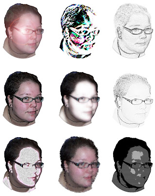 For this one I started out with a picture of me facing the camera. I then erased and cut out everything in the background so that just my head was left. I opened up a new blank image and inserted the head in 9 times, each as a different layer. After that I used a bunch of filters and effects and put a different one on each picture. I then made sure everything was aligned just right and flattened all of the layers.
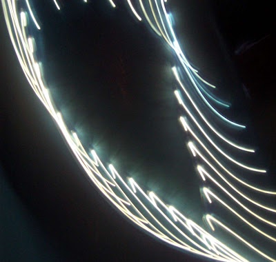
This is an abstract lights picture that I took. Nothing was done to edit this picture. I simply took a string of lights I have in my room and hung them on the wall then snapped a picture as I moved the camera around in a circle. It was very simple and I think it came out great.
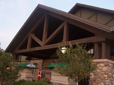
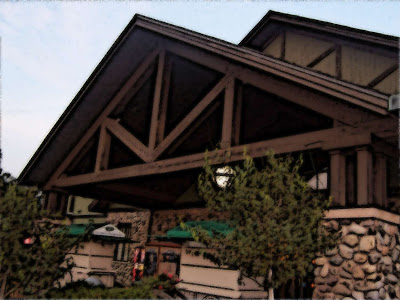
This is a rest stop I took a picture of on the way home to Rochester, NY. After I took the picture I opened it in GIMP and used the cartoon filter on it. After that I used the sharpen tool a couple times to make it more defined.
Pictures from Digital Photography
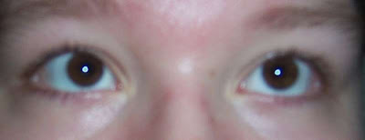
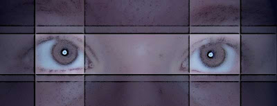 These first two are a picture of my eyes that I took. I took the line tool and drew a series of lines on it in a pattern i liked. I used the measures on the sides of the screen to make sure everything was even. After that I selected areas and colored over it. I did this a few times, overlapping areas to make areas darker.
Abstract....at first it was supposed to be balloons or balls but it reminds me of clowns now. =] Basically I took a blank window and drew different size circles all over and colors them in either blue, red or yellow. I think these colors compliment each other well. I then selected the insides of the circle and made them a shade or two darker and feathered out the edges with the blur tool.

Subscribe to:
Comments (Atom)


